There are some nice looking UI packs on the asset store, however, the first time I bought one I was very disappointed that it was just a set of PNG’s with nothing ‘ready to use’. How do we fix that?
The first time you encounter such an asset, it’s not really intuitive to figure out what you need to do.
In this article we will discuss first how to make those PNG’s usable as regular Unity UI elements (UGUI) and then how to adapt those UGUI elements to use them with Doozy UI
Unity Asset Store Assets
The PNG’s I’m using in any images here are from the Medieval Kingdom UI asset by prolific publisher Poneti. This is part of the UI which will be in use in our in-development game, Keep.
If you haven’t heard of Doozy UI, it’s a framework built on top of ordinary unity GUI’s (UGUI). We’re using the 2022 version here.
While I do recommend Doozy as a stable, useful framework that will add a lot of polish to your interfaces, I have to warn you that recently the support site has been down, which also means the support email bounces and blocks you from finding the discord server unless you already have an invite URL since the in-asset link goes through the broken support site.
There are decent youtube videos, but it can be hard to find the exact info you need. So If you make a purchase, be prepared to figure some stuff out for yourself until they get things fixed.
Converting a PNG to UGUI (Unity UI Elements)
This part is actually super easy.
Firstly, for beginners: You cannot drag a png straight into a scene. You should start by creating a Canvas – all UI needs to be placed on a canvas. You don’t need to use exactly the same setting as us, but the settings below show what we are using.
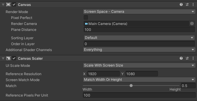
In order to use your png on the canvas you created, you can now just drag your png onto the canvas. It will magically add a Sprite renderer (as long as the texture type is set to Sprite) and will just work.
However, the sprite is not all that functional. To do more interesting things with your element you will need to create an object that has an Image component and an associated Canvas Renderer component. You’ll also need a Rect Transform, not a regular Transform.
There’s no need to create a Material for your UI png, like there is with Textures.
When you’re done, you can create a prefab if you like – and you’ll end up with something like the following:
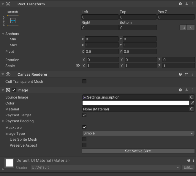
In the image above, ‘Settings_inscription’ is the png we are using. We won’t discuss the different image types here.
Converting a UGUI element to a Doozy UI prefab
Converting png’s to Doozy UI is a little more difficult. In order for Doozy to do a lot of its magic we need to use a few more components. This becomes a bit trickier since in most cases we won’t want to use just one png, but perhaps several – for example a button that has both a sliced background png and a frame png and maybe even an additional png for hover/active/selected state.
Once you create the PNG you also need to make sure it is picked up by the Doozy UI Menu, so it can easily be used in Doozy UIs – and you need to make sure all the parts scale correctly with content.
We’re going to convert the MeidumButtonFrame prefab (the red button in the next image) from the Poneti asset listed above.
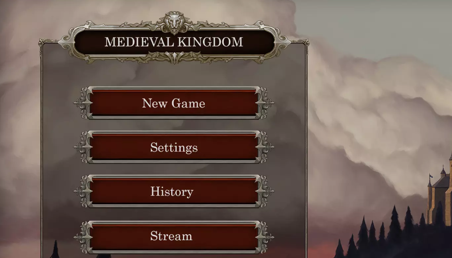
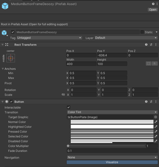 | Step 1 is to create a copy of the prefab we are editing – we don’t want to fund ourselves suddenly unsure of the original settings. Note: A simple way to duplicate something in the Unity Project window is to hold Ctrl while you drag it. It will create a second copy with ‘ 1’ at the end |
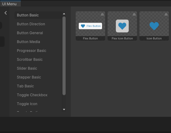 | Step 2 is to add the required components to the root element of the prefab. We can figure out what is useful by looking at some existing Doozy UI Elements. I will base our button on the Flex Button since that is a less-basic button, which handles content fitting. |
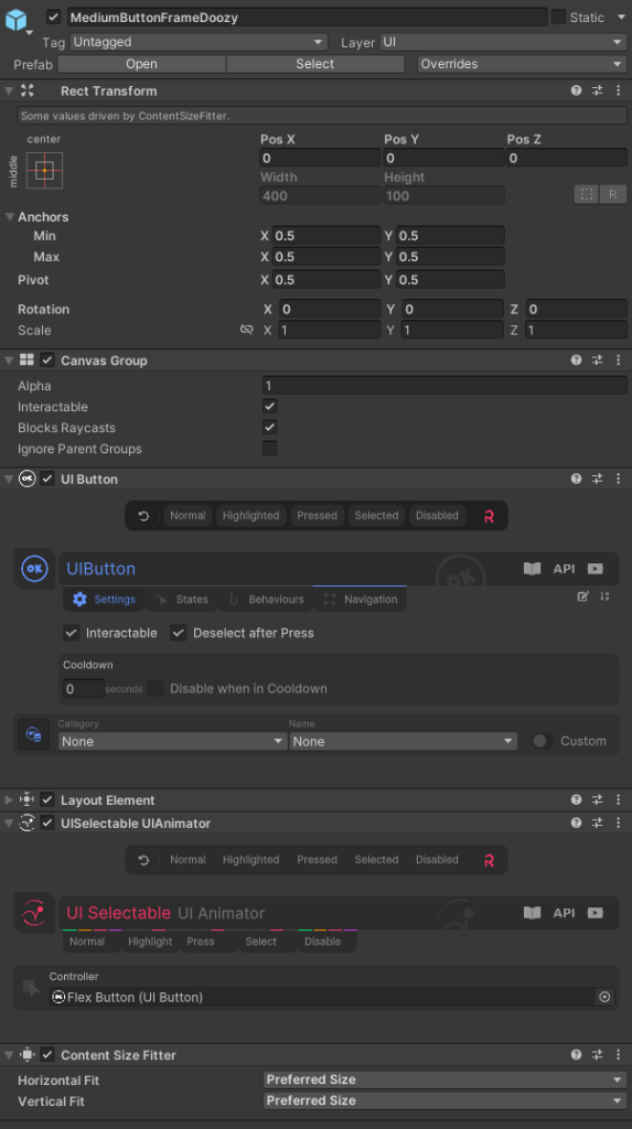 | The components we need to add are: – Canvas Group – UI Button (which will replace our standard Button component) – Layout Element – UISelectable UIAnimator – Content Size Filter The first 4 are easy – we can copy them from the Flex button directly. The Content Size Filter has a caveat – once we paste it, it will likely cause the button content to disappear – don’t panic, the next parts will fix it. |
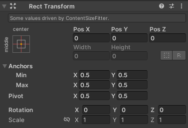 | To begin to make our content visible again we should first make our new rect transform match the Flex button’s, like the image to the left. |
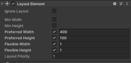 | Then we should configure our preferred size, by ticking the values in the Layout Element component. Once these values match the sizes from the Rect Transform on the original prefab, everything should look normal again. If we test it out at this point, it won’t animate but it will show. |
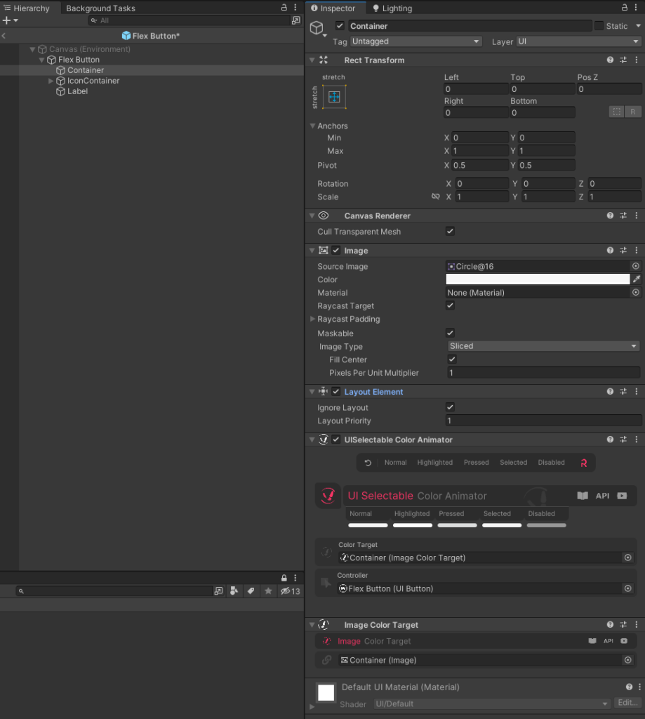 | Step 3 is to add components to the children of the prefab, to make sure they scale as expected. If we look at the Flex Button, the background is the Container element, so we need to copy the way the Container components work to our button background item – the ButtonPlate element. |
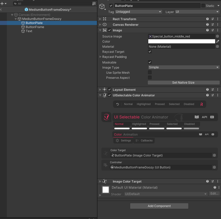 | We should already have an Image, Rect Transform and Canvas Renderer, so we need to copy the Layout Element, UISelectable Color Animator and Image Color Target. We also need to check the fields update on those components, to point at the ButtonPlate element and to the Root element (MediumButtonFrameDoozy) as the Controller. Note: if we copy the Color Animator, Doozy will automatically create a Color Target for us. These will help us animate things – if you test now, you should see a difference when the button is pressed. |
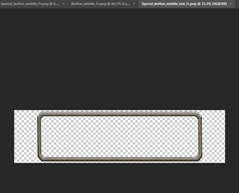 | Step 4 is changing the Frame when we hover over the button. For this I had to make a new variant of the Button_middle_Fr png which fits the same size as the Special_button_middle_Fr png, since the method we will use, won’t automatically fix scaling for us. After adding the new png to Unity, remember to change the Texture type to Sprite (2D and UI) in order to make it usable. |
| Doozy provides components to make this very easy for us. Configured in much the same way as the UISelectable Color animator Earlier. We want to add the UISelectable SpriteSwapper and associated ImageSpriteTarget to our ButtonFrame element as shown. Set the controller as the root and drag your sprites into the fields and everything will work automatically! | |
 | Step 5 is to get our new UI element registered in the Doozy UI Menu. It is not enough to place the new Prefab in the same folder as the others (Doozy/_Extras/Prefabs). You can actually leave the Prefab wherever you like. What is important is to create a UIMenu Item object. In Doozy/_Extras/UIMenu/Items you will find definitions for each UIMenu entry. You can right-click and select Create > Doozy > UI Menu Item. You should drag the prefab we edited earlier into the appropriate slot in the inspector. |
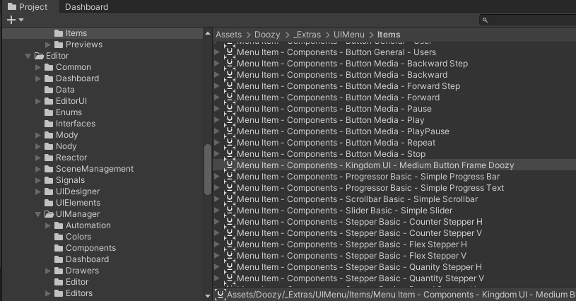 | When you create an item you should read the note below and name/rename it carefully. Doozy requires that the end of the name of a UIMenu item matches the prefab name. The rest of the name defines the path in the UI menu, separated by dashes. Since our prefab was named MediumButtonFrameDoozy and we want to create a whole new category for UI elements from this asset, we went with the following name: Menu Item – Components – Kingdom UI – Medium Button Frame Doozy |
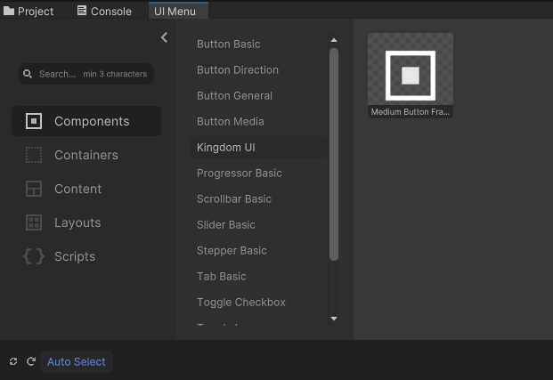 | With the UI Menu Item created all we have to do is update Doozy to see it. From the UI Menu window, click the ‘Regenerate the UI Menu’ icon in the bottom left corner. After a moment you should see your new category appear with the component inside it! |
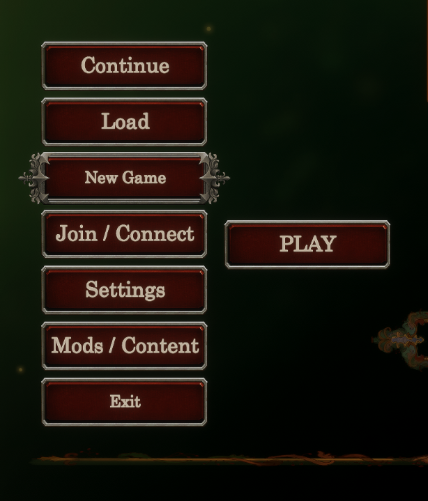 | Step 6 is to test the newly doozified prefab in various conditions – e.g. flat on a canvas and nested in a layout group which will take charge of constraints / scaling, so we can identify any issues to fix. The image to the left shows a standalone button and a set nested in a Doozy Vertical Layout Group |
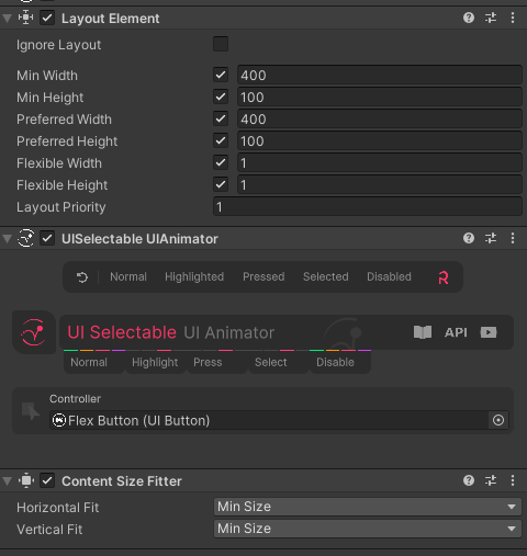 | Step 7 tidy up things that aren’t working the way we like. Your goals may be different from ours, but for us the text scaling was undesirable, so we needed to update our prefab to keep the text size uniform. The scaling happens because we have fixed-size buttons rather than growing to fit. The trade-off with fixing the text size is that it limits the length of the text we can use. To try and combat that, we start by changing the button default size to a ‘minimum size’ meaning it can grow. Like in the image to the left – add a min height and min width to the Layout Element and change the Content Size Filter to use Min Size for both values. |
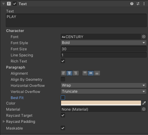 | To stop the text altering itself, all we need to do is uncheck the Best Size checkbox on the text component |
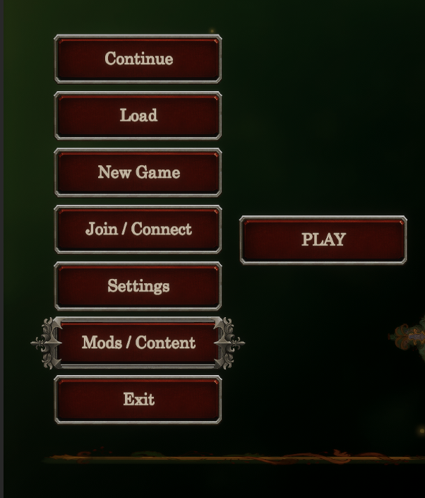 | And that finishes our guide! The image to the left shows our finished component |



Nice article, it helped me!